
Copy & Editorial:
Papyrus Cards
Greeting-card writing is often treated as a cliché or dismissed as a punchline. While true that plenty of card copy leans saccharine, tone-deaf or irrelevant, the space between expectation and what’s possible is what makes the work exciting. I love crafting copy for cards; it allows me to tap into consumer sentiment, explore sender-reciever relationships and, most importantly, play.
All photos courtesy of PRGCO, LLC.
EDITORIAL BRIEF
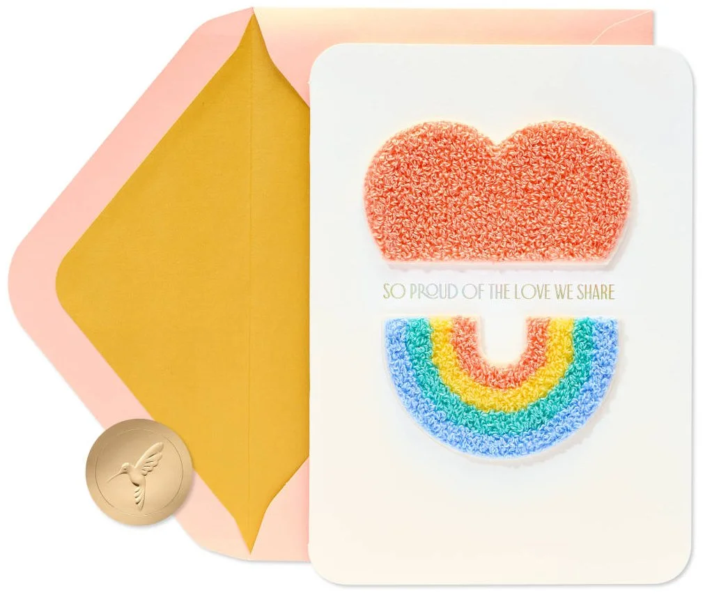
Explore warm connective copy for the anniversary caption that is inclusive and versatile.
CONCEPT DIRECTION
Craft a message celebrating pride and shared love, expressed through simple, clean design and type.
FINAL COPY
PAGE 1 SO PROUD OF THE LOVE WE SHARE
PAGE 3 Here’s to another year of us HAPPY ANNIVERSARY
CAPTION Anniversary, LGBTQ+
ARTIST In-House, Brennan Wood
EDITORIAL BRIEF
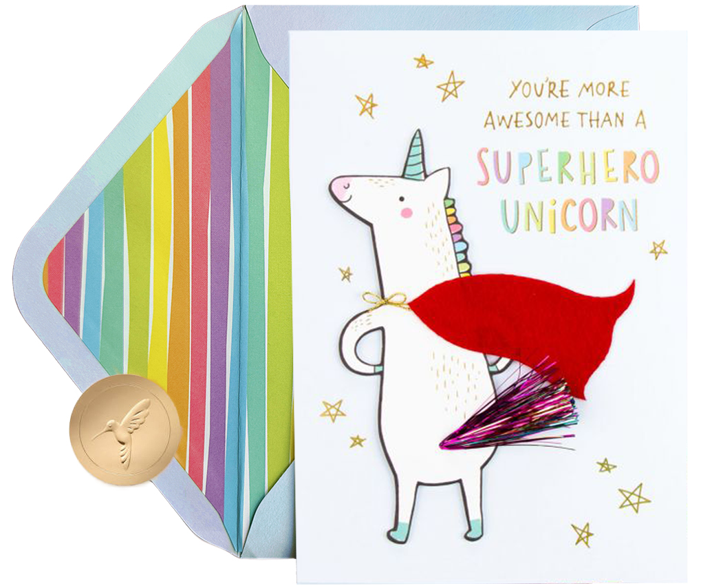
Deliver a playful concept for friendship birthday that incorporates unicorn iconography.
CONCEPT DIRECTION
Double-down on fantasy, incorporating even more magic into unicorn lore while delivering a supportive, affirming message.
FINAL COPY
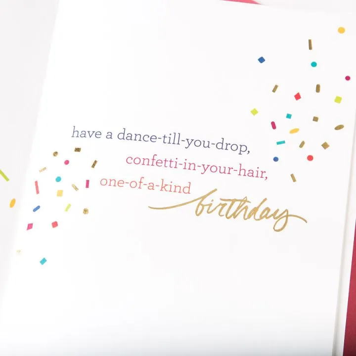
PAGE 1 YOU’RE MORE AWESOME THAN A SUPERHERO UNICORN
PAGE 3 Happy Birthday!
CAPTION Birthday, Friendship
ARTIST In-House, Jess Hong
EDITORIAL BRIEF
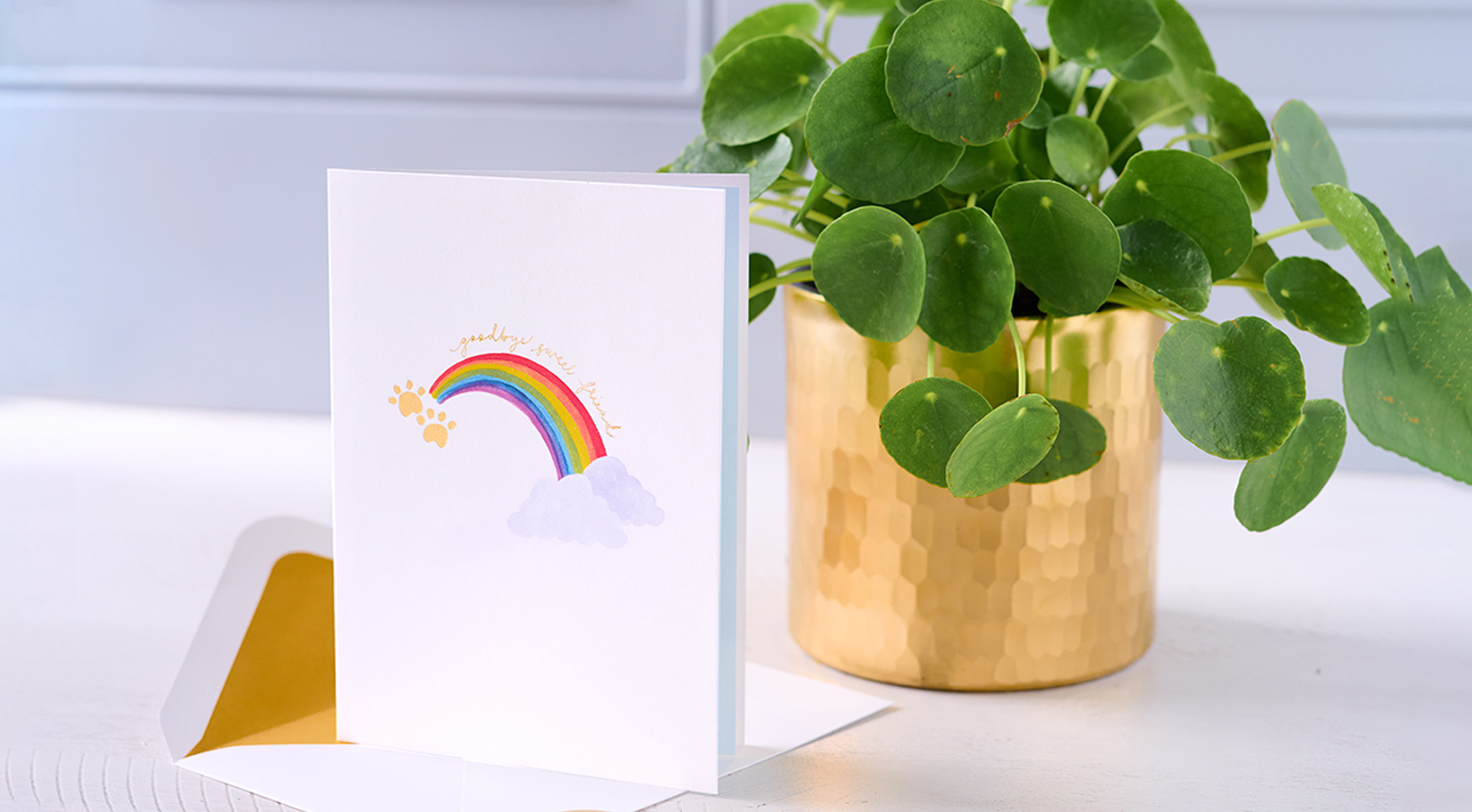
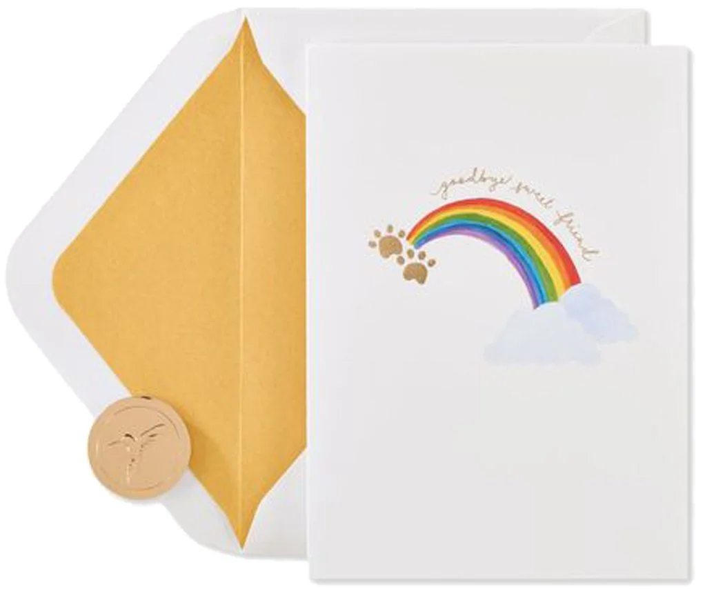
Develop simple, heartfelt copy that honors the loss of a pet, with language that’s versatile enough to resonate across all types of companions.
CONCEPT DIRECTION
Keep copy short and sincere, incorporating rainbow and paw imagery to evoke warmth and remembrance.
FINAL COPY
PAGE 1 goodbye sweet friend
PAGE 3 so sorry for the loss of your wonderful pet
CAPTION Sympathy, Pet
ARTIST In-House, Kristin Lew
Writing Process, Cards
At Papyrus, I discovered that my writing strength lived in the captions where meaning had to land in just a few words. Birthday—the biggest caption—was always a place to experiment with new voices. But I also gravitated toward sympathy, thinking of you, love, and friendship. These categories often default to heavy-handed or overly sentimental tones, yet they’re the moments when people most need help finding the right words. They’re ripe for simple, heartfelt messages that feel authentic to the sender and resonant for the recipient. Striking that balance is challenging—but it’s also the part I enjoy most.
CONCEPT DIRECTION
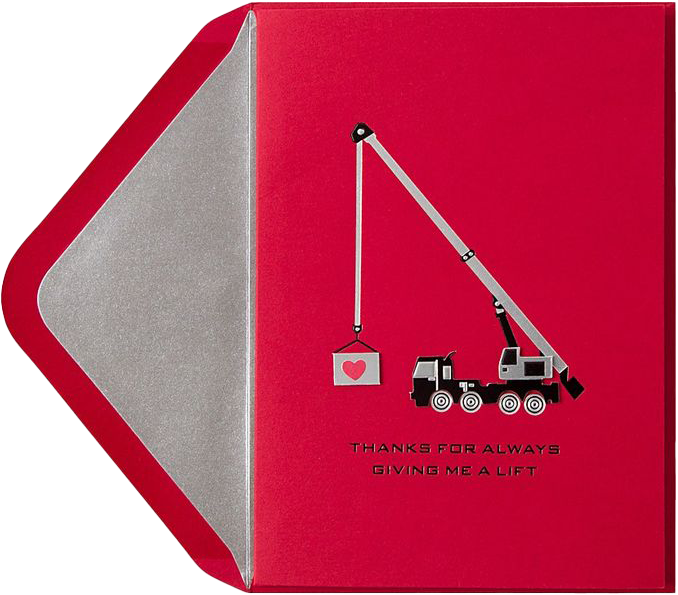
Play with classic construction iconography, with a crafted handmade approach that appeals to senders of all ages.
FINAL COPY
PAGE 1 THANKS FOR ALWAYS GIVING ME A LIFT
CAPTION Father’s Day, Dad
ARTIST In-House
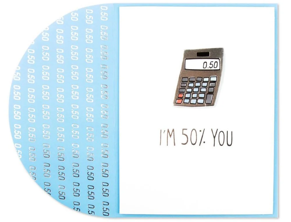
CONCEPT DIRECTION
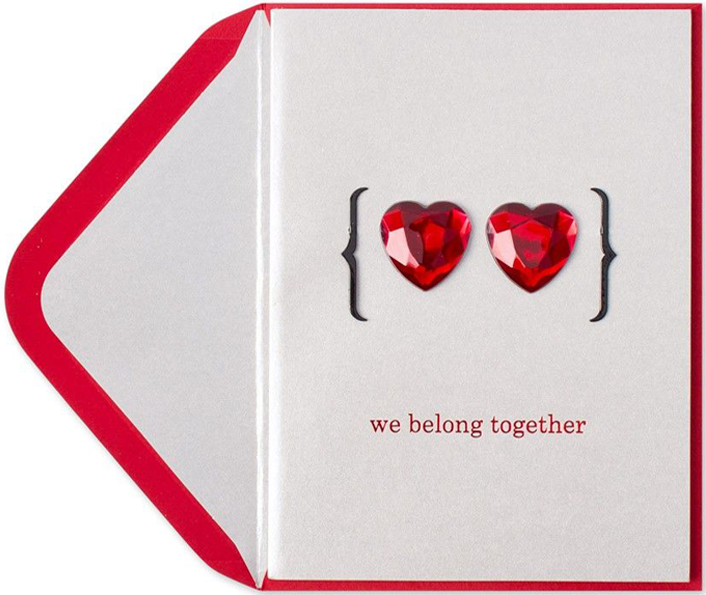
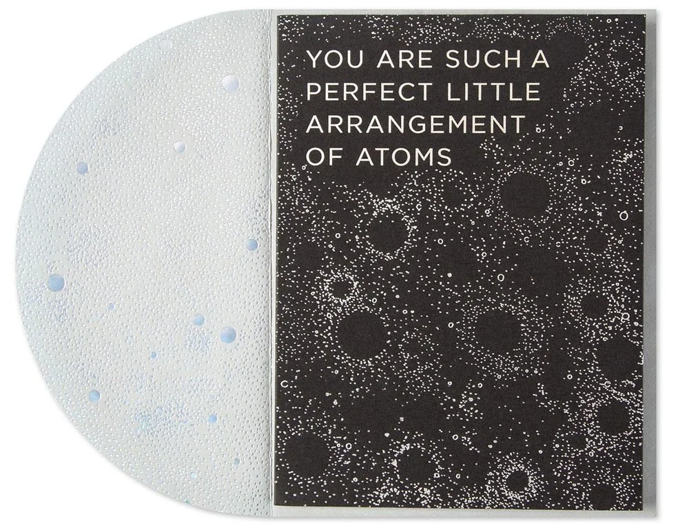
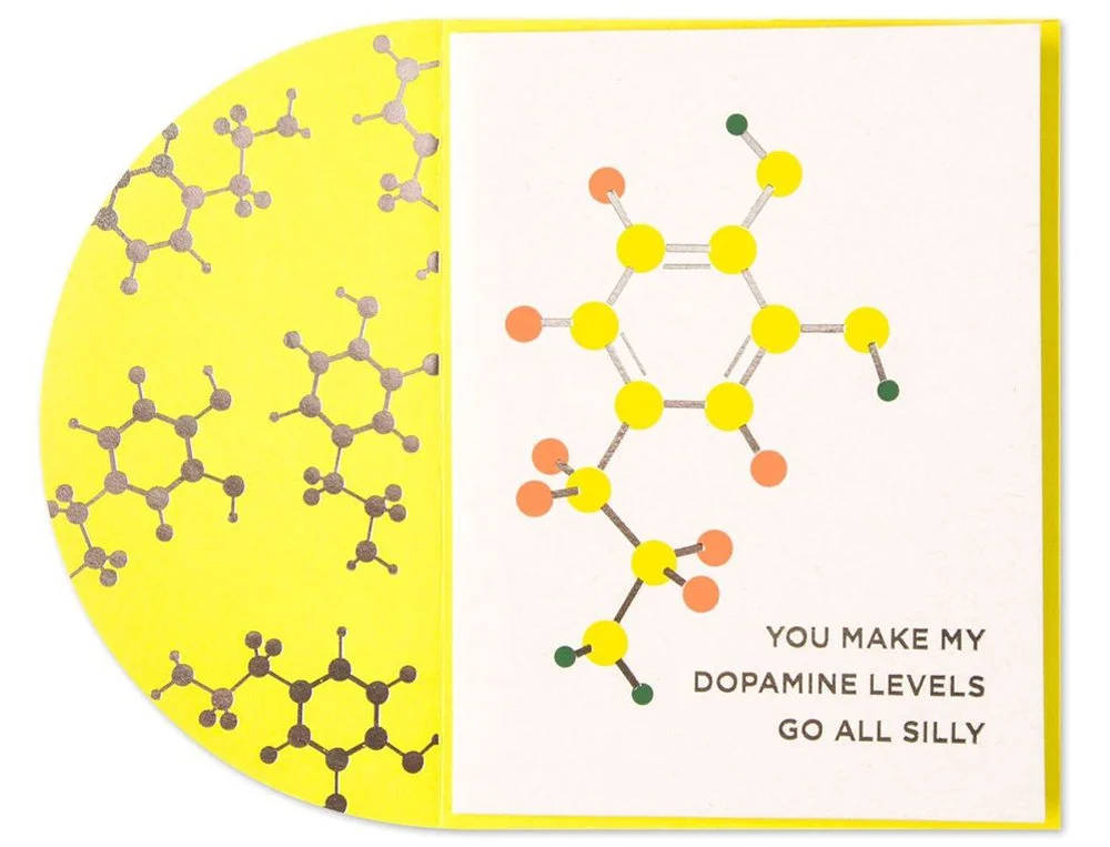
Combine my nerdy love of math and science with a simple, but hit-you-over-the-head adorable message for Valentine’s Day.
FINAL COPY
PAGE 1 we belong together
PAGE 3 …always & forever
CAPTION Valentine’s Day, Love
ARTIST In-House
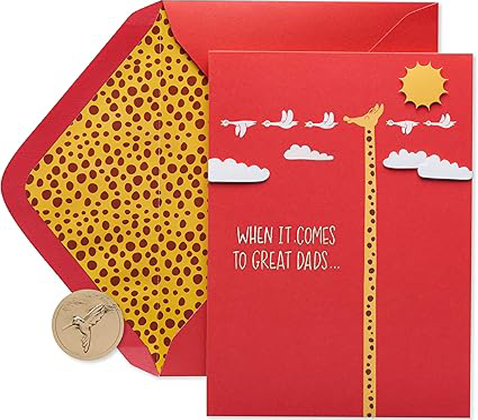
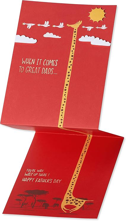
CONCEPT DIRECTION
Collaborate with Lim on a humorous vertical multi-fold design that playfully emphasizes the giraffe’s naturally long neck.
FINAL COPY
PAGE 1/3 WHEN IT COMES TO GREAT DADS…YOU’RE WAY, WAY UP THERE!
CAPTION Father’s Day, General
ARTIST Lim Heng Swee
Bird & Quill · Editorial Approach
Bird & Quill was a sub-brand created to engage a younger audience drawn to authentic, humorous, and topical messaging. The editorial brief opened up a new world of possibilities for the creative team — led by Creative Director Jen Lew — including opportunities to collaborate with new artists/styles, explore fresh copy and expand on sender-receiver relationships. The brand’s voice was real, playful, and conversational—a vibrant contrast to the more traditional tone of Papyrus.
Jen Lew, Senior Art Directors Kari Sullivan and Katri Haycock, and Managing Editor Peter Stein developed all copy for the initial brand launch of 50+ designs. A selection of my favorite contributions can be found below.
Kari’s Papyrus Portfolio